2024
Amazon Seller Central
E-Commerce
UX/UI Design
Web Design
Design Brief
The project is to redesign the Amazon Seller Central portal to improve the user experience for arbitrage Amazon sellers. The current portal is cluttered and confusing, making it difficult for sellers to manage their inventory and optimize their sales.
This project is focused on experience for FBA (Fulfilled by Amazon) sellers.
Scope
E-commerce Dashboard
Alerts (feature)
Timeline
2 weeks
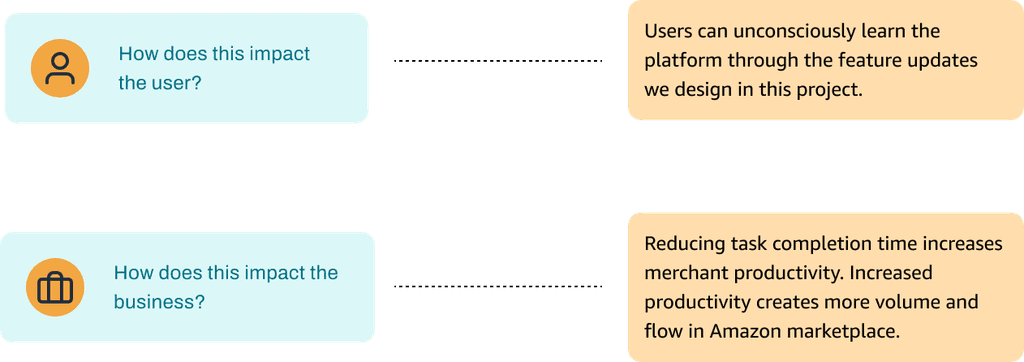
Projected impact
Increased new seller retention
Increased efficiency for store tasks
The old experience
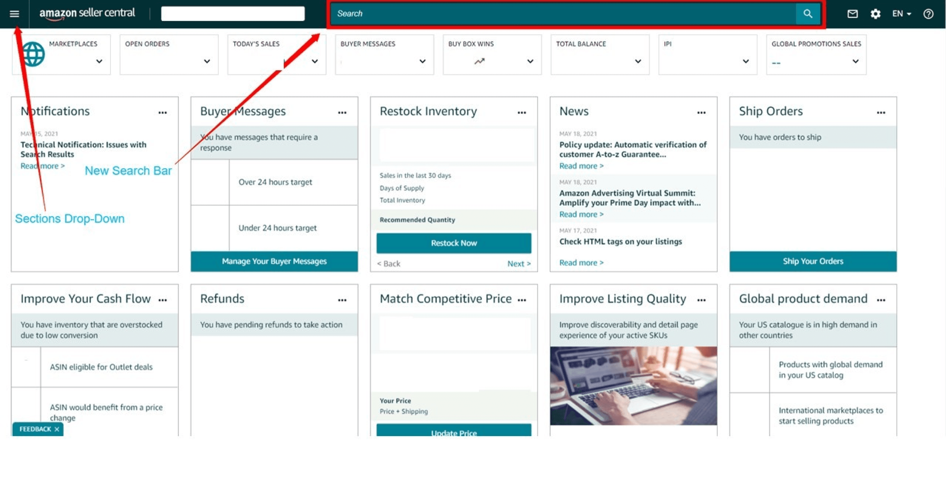
The user journey is too long
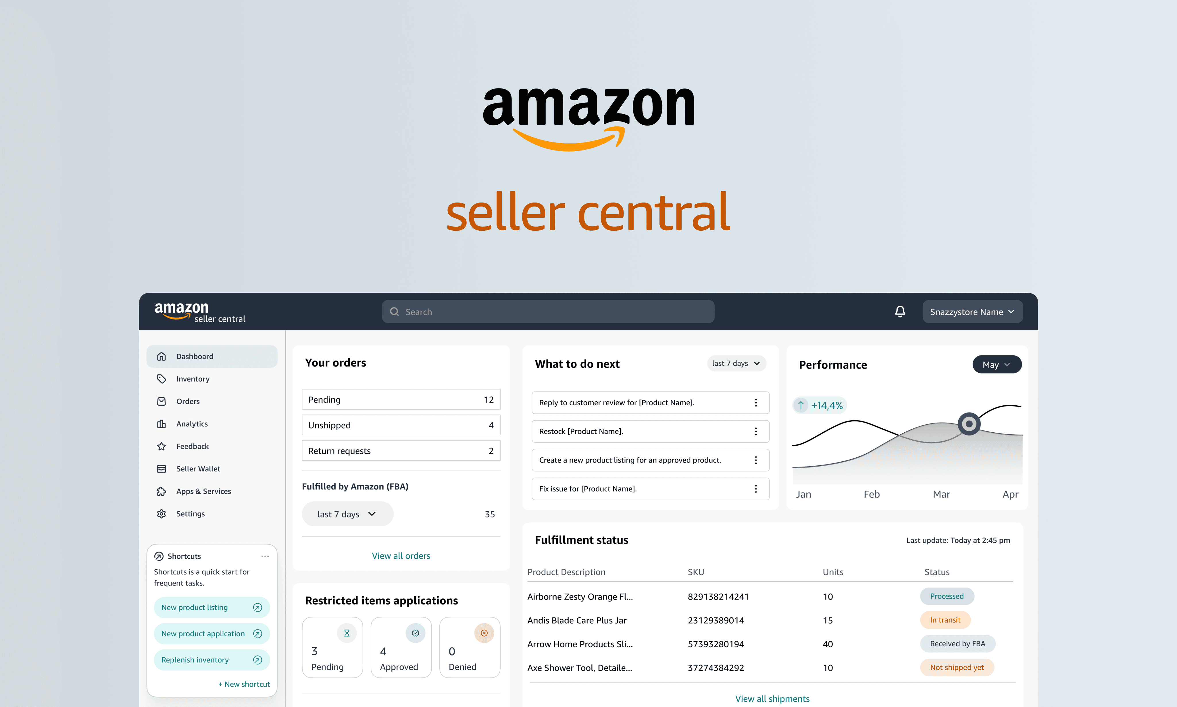
In 2021, Amazon launched a new Amazon Seller Central Dashboard. The launch’s highlighted new features were an updated expandable main menu and smarter search bar to help users navigate the platform.
The problem
Amazon sellers struggle to acclimate to the dashboard, and the learning curve to become a pro is steep.
The solution
Stronger visual hierarchy to guide user eyes to the right information they’re looking for
The old experience overused secondary colors and created a unified but still cluttered dashboard. I designed the new experience using color with intention to make primary information stand out.
The goal
How might we design for easy adoption?
My hypothesis was to approach this challenge with learning as the end goal. If we design for education, we design for adoption.
The design process
This case study addresses complex issues within the navigation flow for merchants (especially those new to Amazon Seller Central). My design decisions are based on user feedback, estimated clicks, and considerations for scalability in the future.
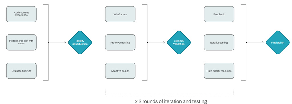
The research
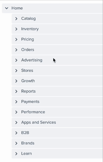
I conducted a simple tree test with the navigation menu that is currently being used on the dashboard. Recruiting experienced Amazon merchants was limited, so I recruited 7 participants (familiar and unfamiliar with the platform). The use of non-experts is to test how a new user would interact with the menu at first glance.
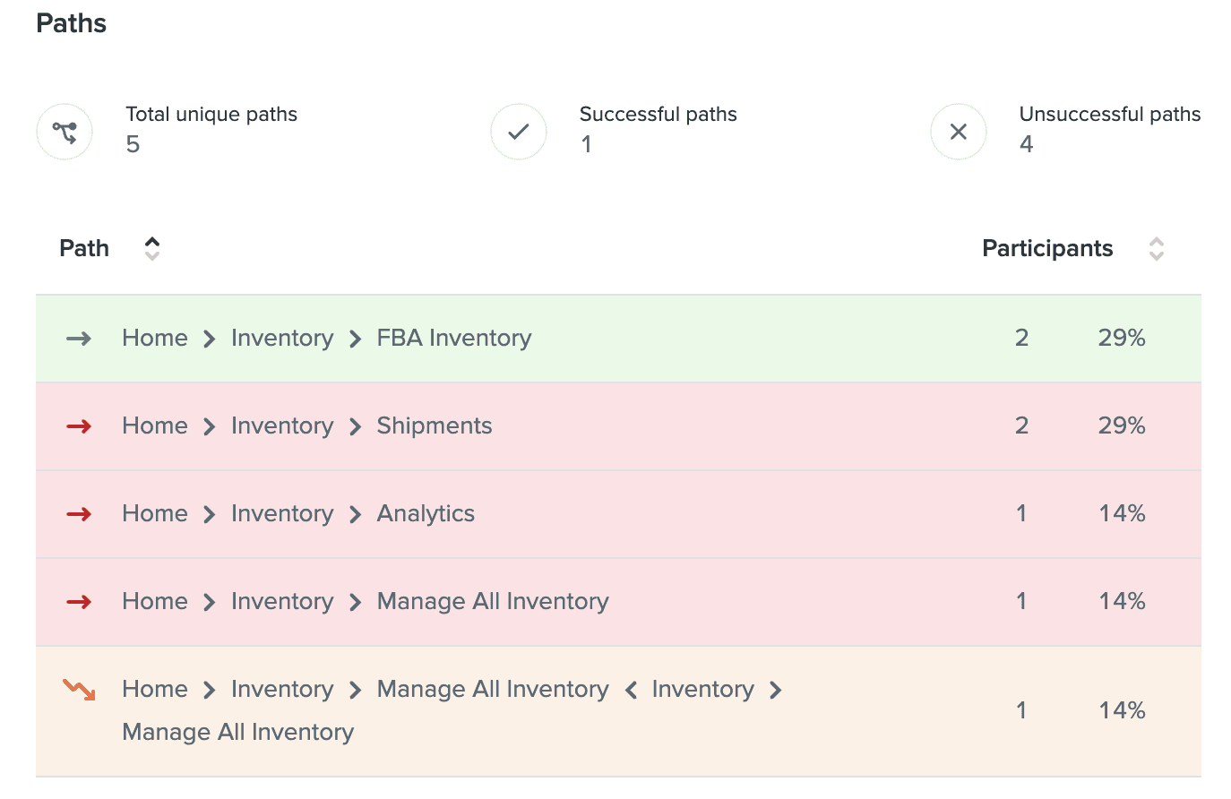
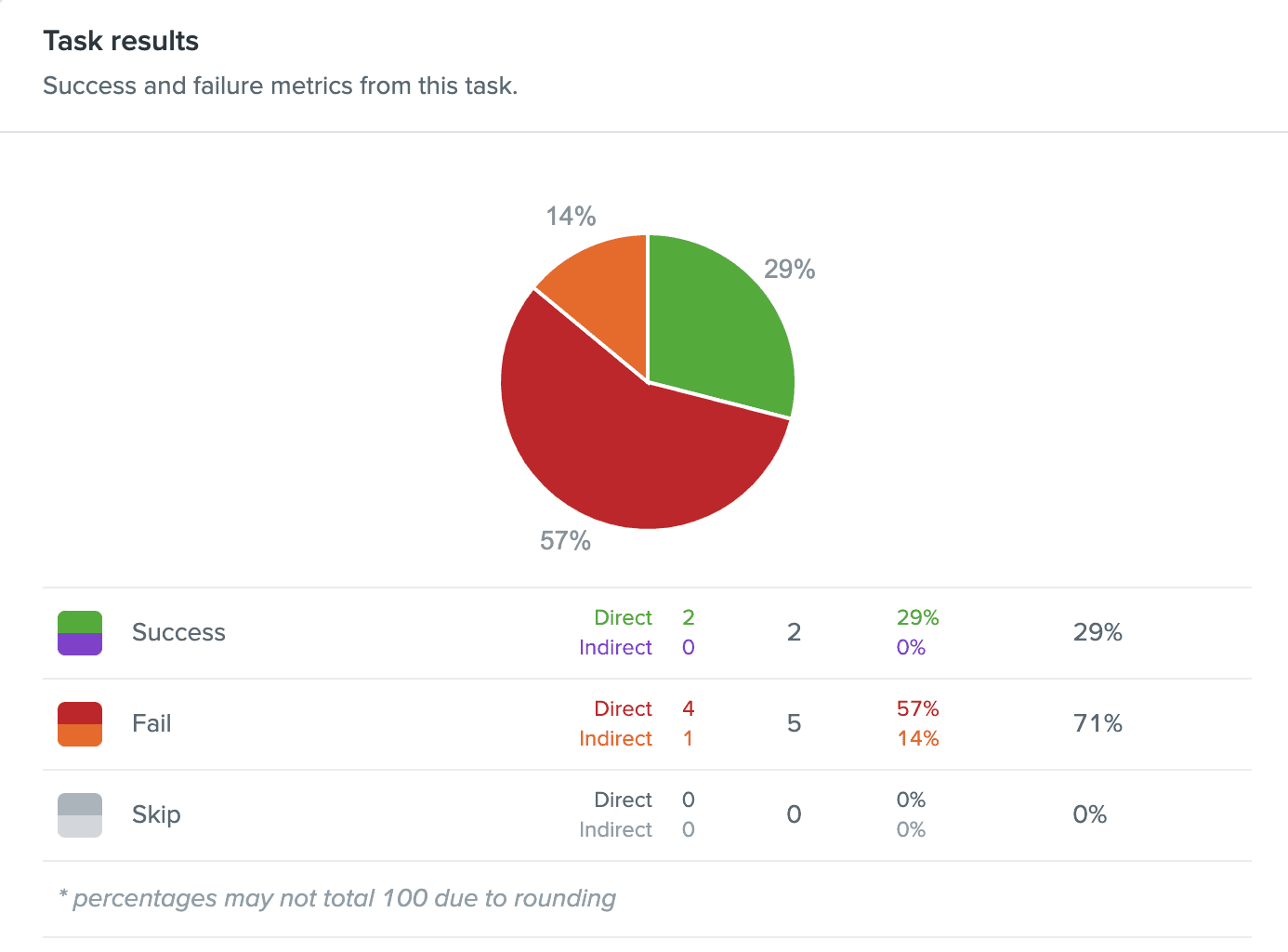
Too much clicking can create misclicks
The tree test findings show that while there is a section for every function on the current navigation menu, there is still confusion.
The post-study questionnaire:
Were there any roadblocks during your process?
Does the current flow and architecture serve your primary goals? If no, explain.

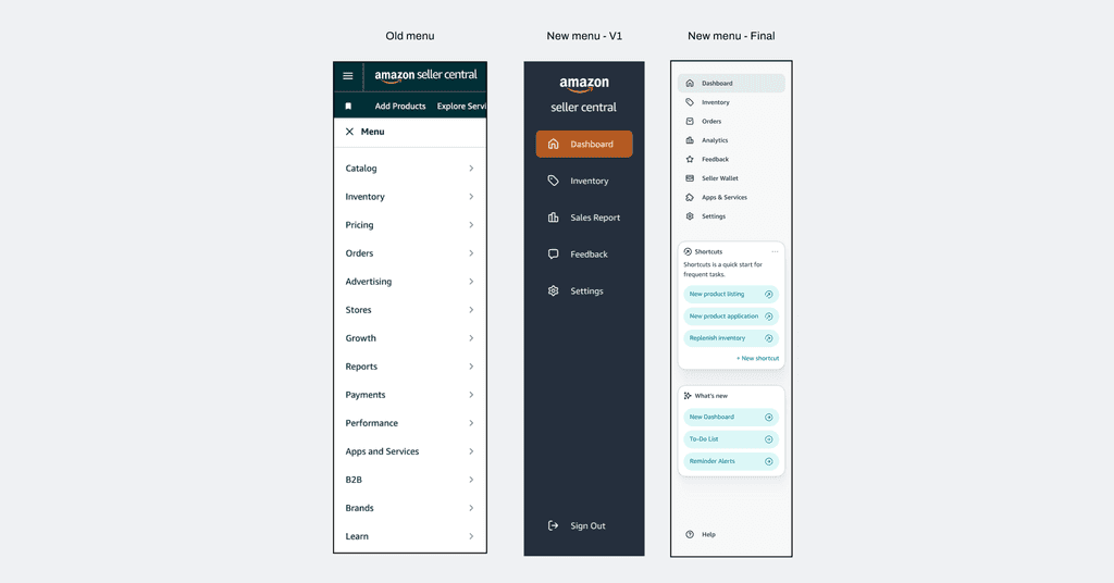
Simple, sleek, straightforward menu
I went through two iterations of the new side bar menu.
I opted for a fixed menu sidebar instead of expandable (like the current). The workflow of a merchant can be complex, which means a lot of tab switching. I wanted to optimize for less clicks without taking away from the workspace.

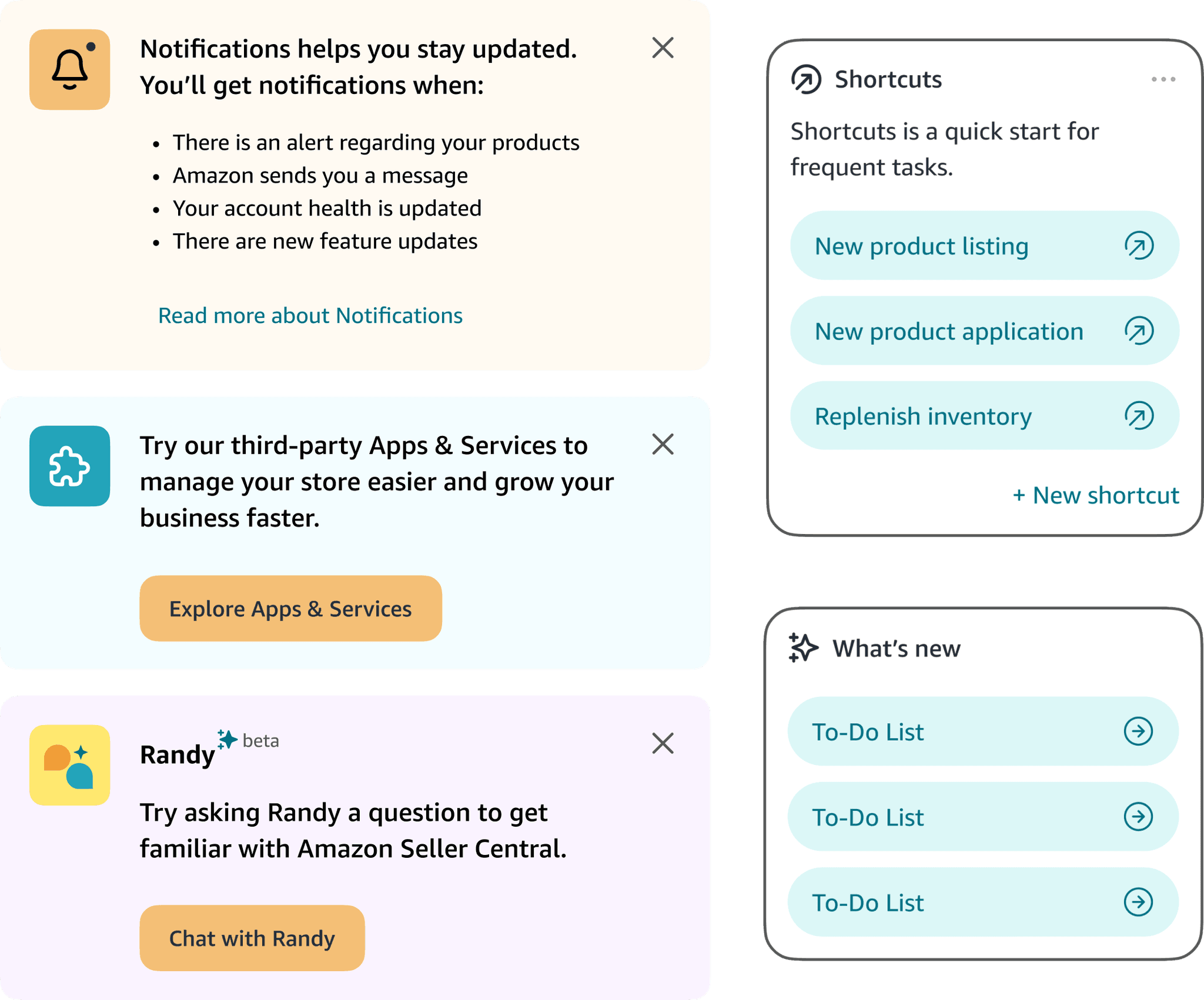
Emphasize early discovery of new features instead of repetitive tasks
During affinity mapping, Notifications were clearly crucial. Users rely on Notifications to complete pending items, respond to requests, or just be in-the-know.
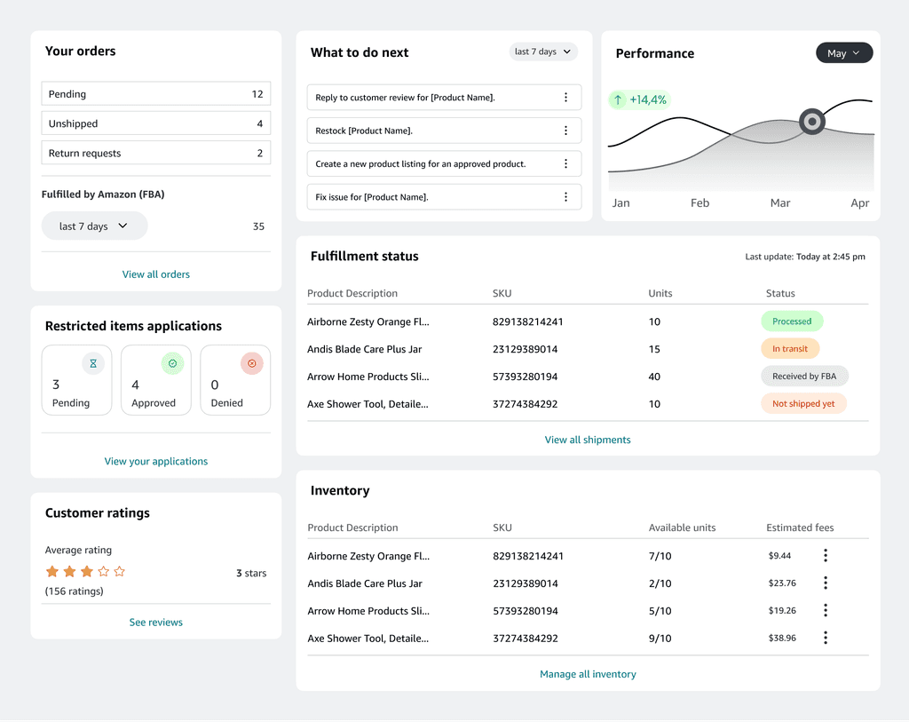
I designed the new Notifications as a side bar can be exposed and closed. The new Notifications contains pending items along with CTA for new features.

The impact
Before
Unclear entry point
Lacking visual hierarchy
After
Clear point of entry for any task
Strong visual hierarchy established by color and type
You've made it to the 🦶🏼!
Thanks for stopping by! If you've made it down here, I hope you found something interesting so far. I'm always open to new projects and connecting.
Currently open to new opportunities.
Get to know me a little.
Created with matcha 🍵 and built with Framer
Tia-Marie Vo © 2023.